Global & nonprofit
· Brand identity · Stationery · Annual report
DCPCA Rebrand
From
From: A clinical look for a coalition
From: A clinical look for a coalition
From: A clinical look for a coalition
From: A clinical look for a coalition
To
A mark made of intersections
Client
District of Columbia Primary Care Association
District of Columbia Primary Care Association
Studio
Creative Cycle
Creative Cycle
My role
Creative direction
Creative direction
Years
2026
2026
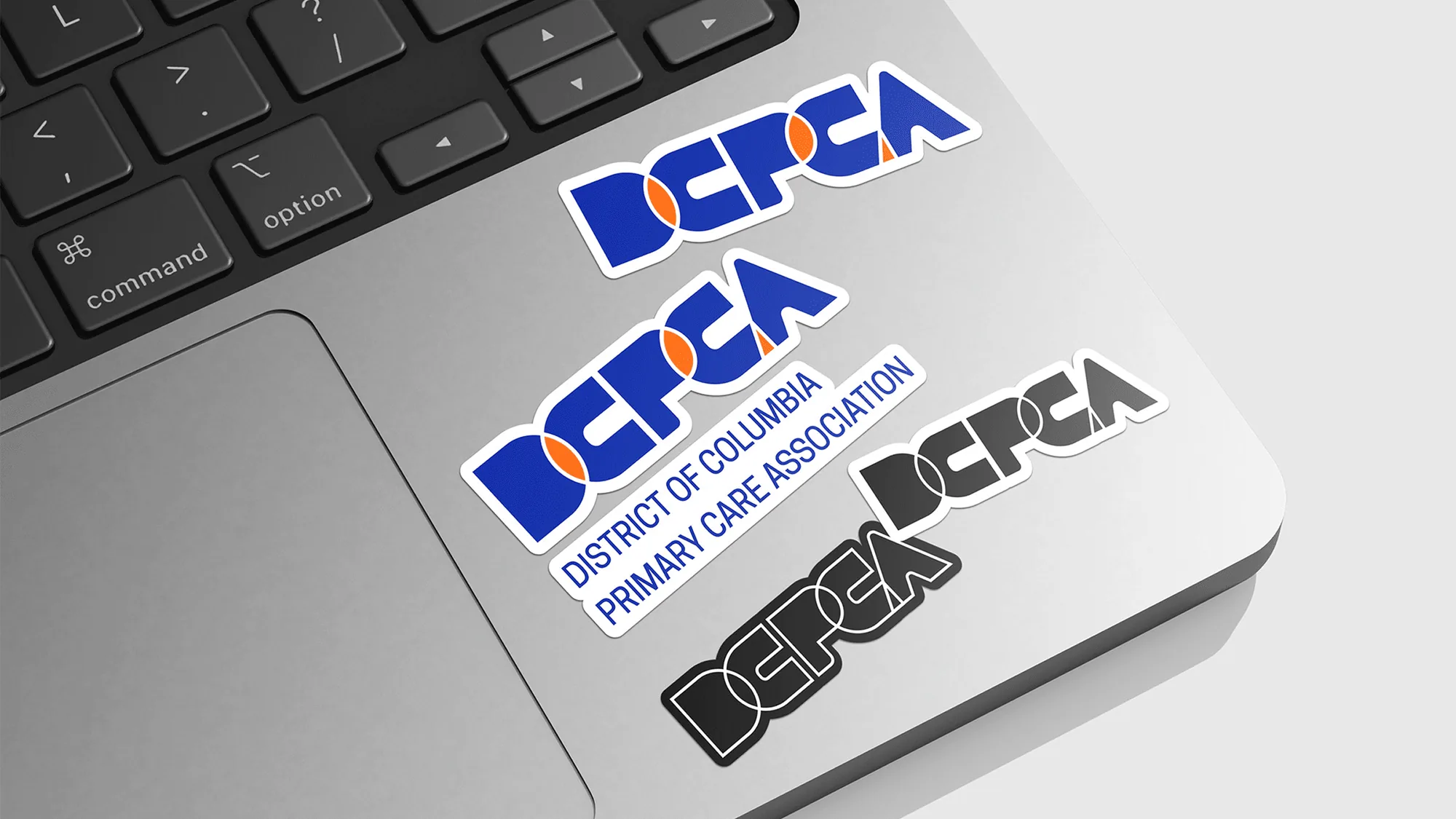
Fig. 01
The DCPCA mark as stickers.
01
The gap
The gap
DCPCA is not a clinic. It is where the District’s community health centers, policy makers and community advocates meet, and it argues for every resident’s access to primary care. Health branding defaults to clinical or corporate. Neither of those says what an association actually does, which is get separate organizations to act as one.
DCPCA is not a clinic. It is where the District’s community health centers, policy makers and community advocates meet, and it argues for every resident’s access to primary care. Health branding defaults to clinical or corporate. Neither of those says what an association actually does, which is get separate organizations to act as one.
On one side
DCPCA, the association that connects the District’s health centers and advocates
On one side
DCPCA, the association that connects the District’s health centers and advocates
On the other
Residents whose access to primary care depends on those groups acting together
On the other
Residents whose access to primary care depends on those groups acting together


02
The translation
The translation
The idea that crossed
The overlap is the logo.
The idea that crossed
The overlap is the logo.
What we made
A logo built on geometric intersections
Brand guidelines
Stationery
An annual report template
Creative Cycle and TESS Partners ran the process together, combining strategy and design, and we explored directions until one held both authority and community. The mark is built from geometric intersections: the places where separate organizations meet. Overlapping forms say the association is more than the sum of its parts, and that its power sits in the connections it makes. From there the system extends into a brand guide, stationery and an annual report template, so the idea survives contact with everyday documents.
What we made
A logo built on geometric intersections
Brand guidelines
Stationery
An annual report template
Creative Cycle and TESS Partners ran the process together, combining strategy and design, and we explored directions until one held both authority and community. The mark is built from geometric intersections: the places where separate organizations meet. Overlapping forms say the association is more than the sum of its parts, and that its power sits in the connections it makes. From there the system extends into a brand guide, stationery and an annual report template, so the idea survives contact with everyday documents.
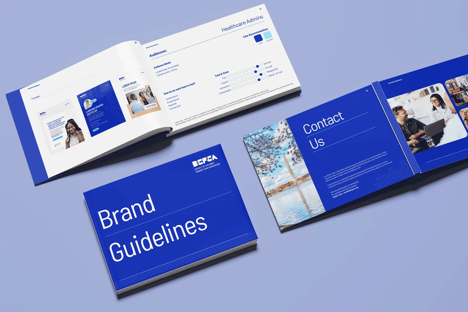
Fig. 02
The brand guidelines.
Fig. 02
The brand guidelines.

Fig. 03
Folder and letterhead.
Fig. 03
Folder and letterhead.
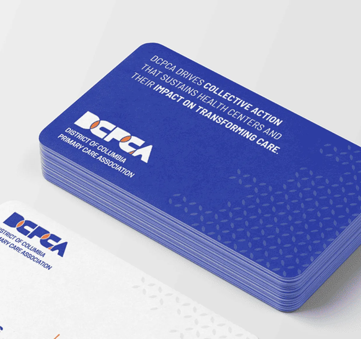
Fig. 04
The back of the business card.
Fig. 04
The back of the business card.
03
What happened
What happened
A brand built on the language of partnership instead of clinical care
A mark that reads to member health centers and community partners alike
Stationery and an annual report template that keep the system consistent
A brand built on the language of partnership instead of clinical care
A mark that reads to member health centers and community partners alike
Stationery and an annual report template that keep the system consistent
Good to know
DCPCA’s 2025 annual report, Collective Action: A Year of Transformation, runs on the new system.
04
What I did
What I did
I led creative direction on the rebrand, sharing creative direction with Jose Caicedo and working alongside TESS Partners on strategy. My job was to keep every round pointed at one idea: DCPCA’s power is in the connections it makes, so the mark should be made of them.
I led creative direction on the rebrand, sharing creative direction with Jose Caicedo and working alongside TESS Partners on strategy. My job was to keep every round pointed at one idea: DCPCA’s power is in the connections it makes, so the mark should be made of them.
05
Made with
Made with
Client
Client
District of Columbia Primary Care Association
Studio
Studio
Creative Cycle
Co-creative direction
Co-creative direction
Jose Caicedo
In collaboration with
In collaboration with
TESS Partners
Next story