Culture
· Naming · Brand identity · Book covers · Website
People Power Publishers and The Hum
From
From: One house style for every movement
From: One house style for every movement
From: One house style for every movement
From: One house style for every movement
To
Ink and a hum
Client
Center for Nonviolent Conflict Research
Center for Nonviolent Conflict Research
Studio
Creative Cycle
Creative Cycle
My role
Creative direction
Creative direction
Years
2026
2026
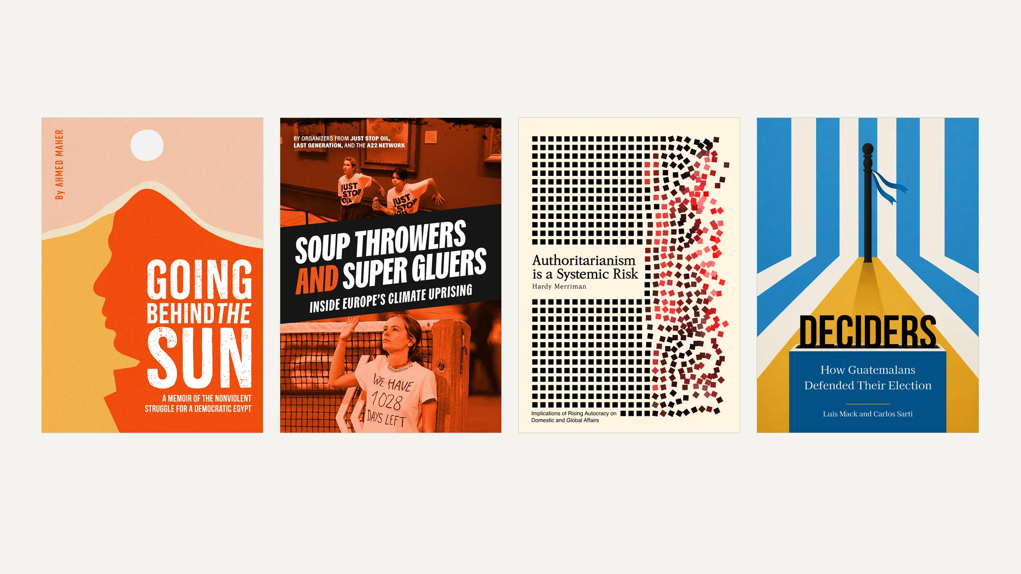
Fig. 01
Four books from one house.
01
The gap
The gap
The Center for Nonviolent Conflict Research studies how ordinary people win rights without violence, and the people who hold that knowledge are usually the ones who lived it. For a decade its books went out under one institutional template. Its new podcast faced the opposite default, the polished neutral look of tech media. Both flatten the source.
The Center for Nonviolent Conflict Research studies how ordinary people win rights without violence, and the people who hold that knowledge are usually the ones who lived it. For a decade its books went out under one institutional template. Its new podcast faced the opposite default, the polished neutral look of tech media. Both flatten the source.
On one side
The Center for Nonviolent Conflict Research, publishing first-hand accounts of resistance
On one side
The Center for Nonviolent Conflict Research, publishing first-hand accounts of resistance
On the other
Organizers, scholars and listeners deciding what is worth their attention
On the other
Organizers, scholars and listeners deciding what is worth their attention


02
The translation
The translation
The idea that crossed
Let the story set the form.
The idea that crossed
Let the story set the form.
What we made
A new name and identity for the publisher, replacing ICNC Press
The first four covers under the new system: Going Behind the Sun, Soup Throwers and Super Gluers, Authoritarianism is a Systemic Risk and Deciders
The publisher’s website, including the catalogue and the four ways into it
The name and identity for The Hum
Brand guidelines and media visuals for the podcast
02a · The publisher. The press had spent a decade as ICNC Press, and its books wore the institution on the cover: one navy template, a series label across the top, the logo at the foot. A hunger strike in Palestine, judicial resistance in Poland and young organizers in Zambia all arrived looking like the same document. The new name moves the emphasis from the institute to the subject, and the mark is a set of overlapping letters, one form made of several. Then each cover was allowed to come from its own book. The first four: a face turning into a landscape for a memoir of the Egyptian revolution, a climate protester in hard duotone, a ballot column, and a grid of type dissolving into noise for an essay on authoritarian risk. Nothing on them says which series they belong to. The site had to hold that idea up rather than undo it, so the catalogue does not sort by series either. It opens four ways in, by format, topic, region and country, and lets a reader arrive by the thing that brought them there: a memoir, a continent, one country’s fight. The covers do the arguing and the filters do the finding.
02b · The podcast. The Hum started with naming, and it took a while. We tested many options before The Hum, which is the literal sound a data center makes and also the thing you stop hearing, which is the show’s whole argument. The logotype is heavy and tactile, a human weight against the mechanical parts of the design. The logo is a radial burst, the moment human-scale reality and industrial infrastructure hit each other, in high-contrast color and fragmented lines. The pieces scattering outward stand for the active resistance of the communities the series follows.
What we made
A new name and identity for the publisher, replacing ICNC Press
The first four covers under the new system: Going Behind the Sun, Soup Throwers and Super Gluers, Authoritarianism is a Systemic Risk and Deciders
The publisher’s website, including the catalogue and the four ways into it
The name and identity for The Hum
Brand guidelines and media visuals for the podcast
02a · The publisher. The press had spent a decade as ICNC Press, and its books wore the institution on the cover: one navy template, a series label across the top, the logo at the foot. A hunger strike in Palestine, judicial resistance in Poland and young organizers in Zambia all arrived looking like the same document. The new name moves the emphasis from the institute to the subject, and the mark is a set of overlapping letters, one form made of several. Then each cover was allowed to come from its own book. The first four: a face turning into a landscape for a memoir of the Egyptian revolution, a climate protester in hard duotone, a ballot column, and a grid of type dissolving into noise for an essay on authoritarian risk. Nothing on them says which series they belong to. The site had to hold that idea up rather than undo it, so the catalogue does not sort by series either. It opens four ways in, by format, topic, region and country, and lets a reader arrive by the thing that brought them there: a memoir, a continent, one country’s fight. The covers do the arguing and the filters do the finding.
02b · The podcast. The Hum started with naming, and it took a while. We tested many options before The Hum, which is the literal sound a data center makes and also the thing you stop hearing, which is the show’s whole argument. The logotype is heavy and tactile, a human weight against the mechanical parts of the design. The logo is a radial burst, the moment human-scale reality and industrial infrastructure hit each other, in high-contrast color and fragmented lines. The pieces scattering outward stand for the active resistance of the communities the series follows.
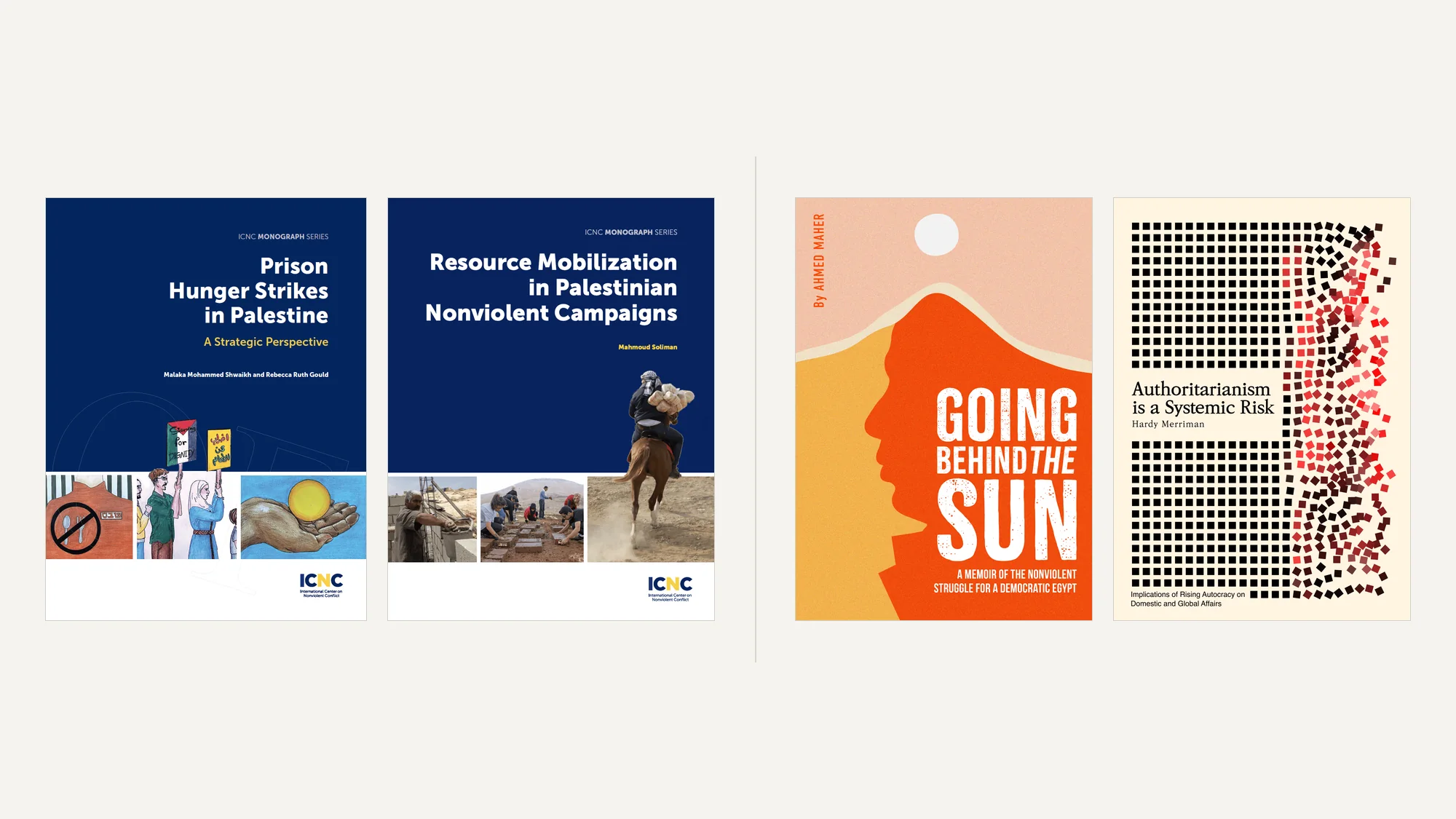
Fig. 02
Before: the monograph template, the same face for every movement. After: two covers that take after their books.
Fig. 02
Before: the monograph template, the same face for every movement. After: two covers that take after their books.
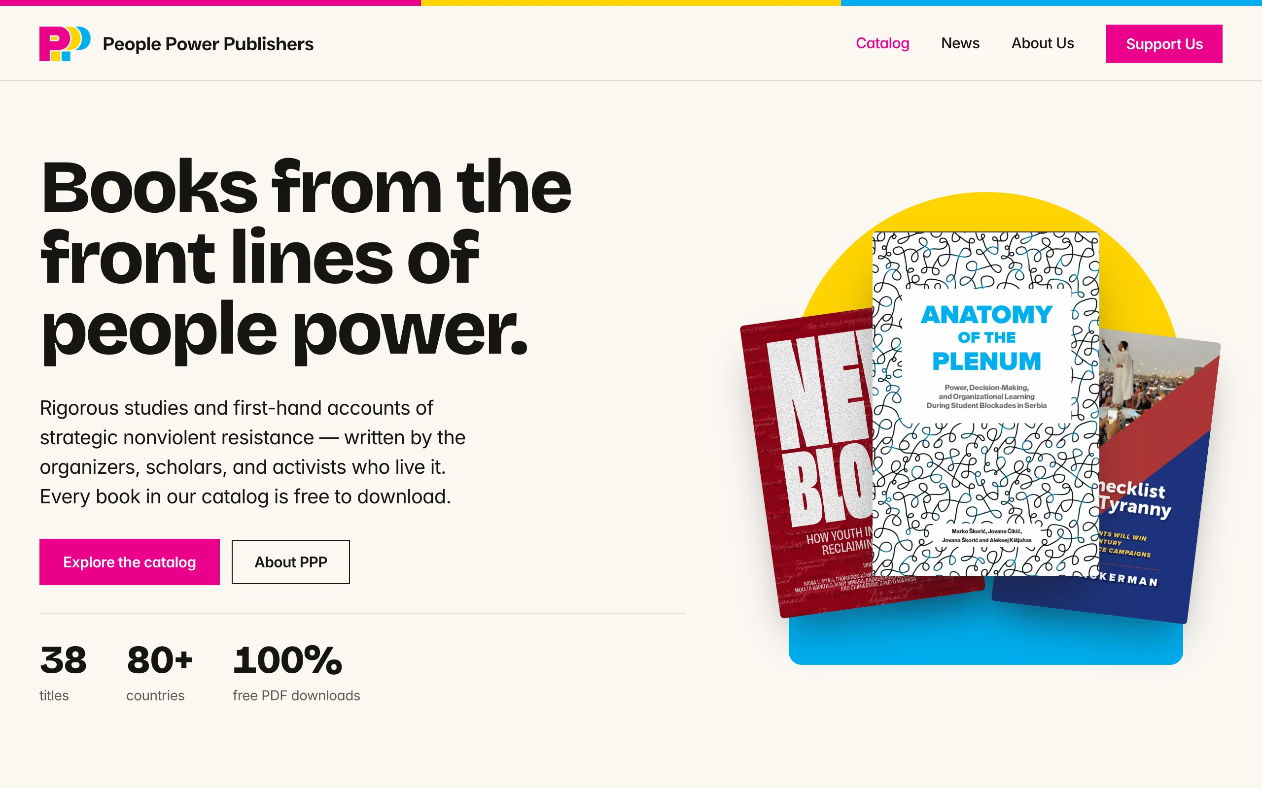
Fig. 03
The home page.
Fig. 03
The home page.
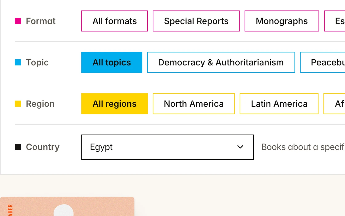
Fig. 04
In the catalog, each ink is a way in: magenta for format, cyan for topic, yellow for region, black for country.
Fig. 04
In the catalog, each ink is a way in: magenta for format, cyan for topic, yellow for region, black for country.
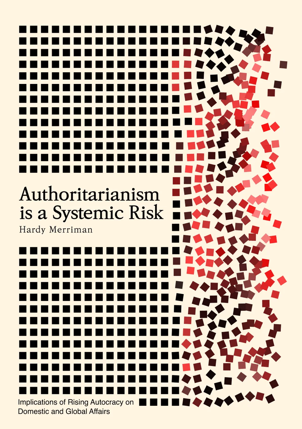
Fig. 05
Research, drawn as data.
Fig. 05
Research, drawn as data.

Fig. 06
The logo on a microphone cube.
Fig. 06
The logo on a microphone cube.
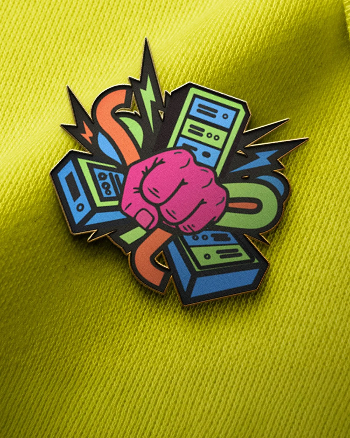
Fig. 07
The enamel pin.
Fig. 07
The enamel pin.

Fig. 08
The show art in the app.
Fig. 08
The show art in the app.
03
What happened
What happened
A publisher renamed and relaunched, after a decade as ICNC Press
A cover system with no series template, proven on four books as different as an Egyptian memoir and an essay on authoritarian risk, and still taking new titles
A site built around the catalogue, where four filters replace the series shelf
A name and identity for The Hum, from the naming phase through the visual language
Two brands for the same institute that look like what they carry, not like the institute
A publisher renamed and relaunched, after a decade as ICNC Press
A cover system with no series template, proven on four books as different as an Egyptian memoir and an essay on authoritarian risk, and still taking new titles
A site built around the catalogue, where four filters replace the series shelf
A name and identity for The Hum, from the naming phase through the visual language
Two brands for the same institute that look like what they carry, not like the institute
Good to know
People Power Publishers ran as ICNC Press from 2015 to 2025. Its catalogue holds 38 titles from more than 80 countries, every book is free to download, and new titles keep arriving. The Hum investigates the impact of data centers on the communities living in their shadows. Its line: Stories from the ground beneath the cloud.
04
What I did
What I did
I led creative direction on both, from Creative Cycle. On the publisher that meant the name, the mark, the site, and the rule that each book gets a cover out of its own story, then directing the first four. The covers keep coming, so the rule has to keep working without me redrawing it each time. On the podcast it meant the naming phase first and the visual language after. The two jobs met on the same point: this institute’s authority comes from people who lived what they are describing, so neither the books nor the show should look like they came from an institution.
I led creative direction on both, from Creative Cycle. On the publisher that meant the name, the mark, the site, and the rule that each book gets a cover out of its own story, then directing the first four. The covers keep coming, so the rule has to keep working without me redrawing it each time. On the podcast it meant the naming phase first and the visual language after. The two jobs met on the same point: this institute’s authority comes from people who lived what they are describing, so neither the books nor the show should look like they came from an institution.
05
Made with
Made with
Client
Client
Center for Nonviolent Conflict Research
Studio
Studio
Creative Cycle
Next story