Culture
· Brand identity · Campaign
DC Jazz Festival
From
From: A new identity every year
From: A new identity every year
From: A new identity every year
From: A new identity every year
To
One system that improvises
Client
DC Jazz Festival
DC Jazz Festival
Agency
Sage Communications
Sage Communications
My role
Creative direction
Creative direction
Years
2018–present
2018–present

Fig. 01
Key art for the festival’s 20th anniversary.
01
The gap
The gap
Most festivals have one identity. DC Jazz Festival needs a new one every year, fresh enough to feel current and familiar enough to feel like the same festival. It also ships on the festival’s calendar. Nobody moves that deadline when tens of thousands of people are headed to The Wharf.
Most festivals have one identity. DC Jazz Festival needs a new one every year, fresh enough to feel current and familiar enough to feel like the same festival. It also ships on the festival’s calendar. Nobody moves that deadline when tens of thousands of people are headed to The Wharf.
On one side
A festival that has celebrated jazz in Washington for 20 years
On one side
A festival that has celebrated jazz in Washington for 20 years
On the other
Jazz purists, first-time listeners, families, locals and visitors from 20+ countries
On the other
Jazz purists, first-time listeners, families, locals and visitors from 20+ countries
02
The translation
The translation
The idea that crossed
Jazz improvises. The brand does too.
The idea that crossed
Jazz improvises. The brand does too.
What we made
A new visual direction every year on one modular system
A blue and white mark for the 20th anniversary
Event signage and on-site graphics
Social content, digital ads and email campaigns
Out-of-home, including Metrorail
Program guides, T-shirts and merchandise
Each year brings a new palette, a new graphic language and a new energy. The framework underneath stays put and scales from digital ads to stage backdrops. For the 20th anniversary, the Sage team added a blue and white mark to sit next to the festival’s signature red. And the T-shirts? Regulars collect them.
What we made
A new visual direction every year on one modular system
A blue and white mark for the 20th anniversary
Event signage and on-site graphics
Social content, digital ads and email campaigns
Out-of-home, including Metrorail
Program guides, T-shirts and merchandise
Each year brings a new palette, a new graphic language and a new energy. The framework underneath stays put and scales from digital ads to stage backdrops. For the 20th anniversary, the Sage team added a blue and white mark to sit next to the festival’s signature red. And the T-shirts? Regulars collect them.
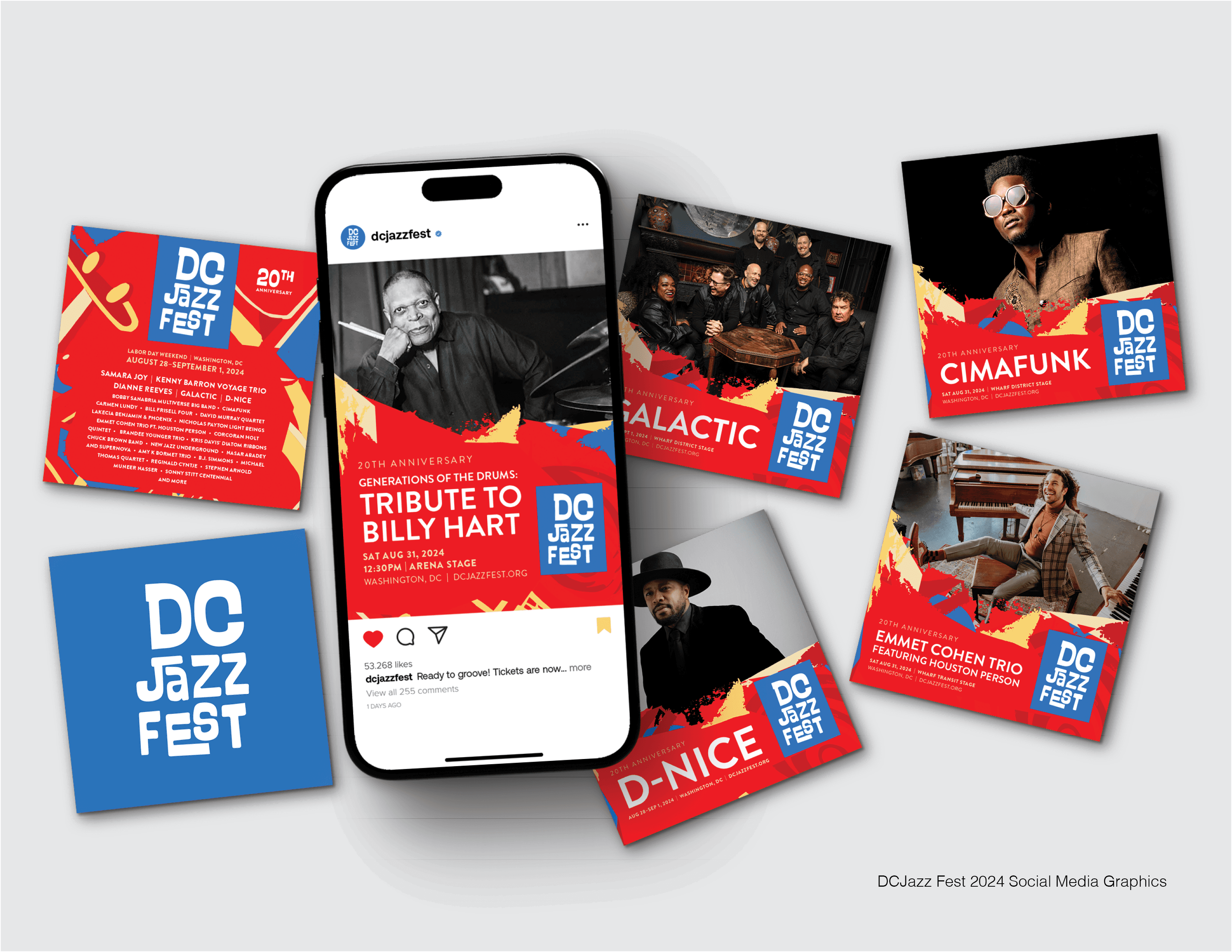
Fig. 02
Social media graphics.
Fig. 02
Social media graphics.
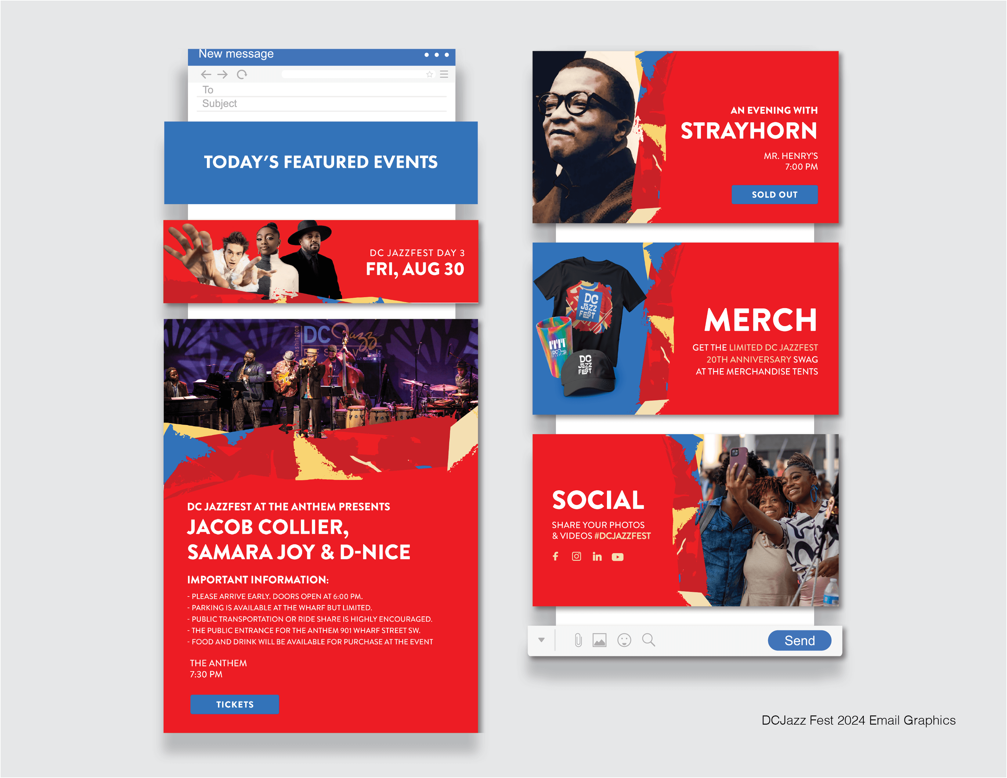
Fig. 03
Email graphics.
Fig. 03
Email graphics.
03
What happened
What happened
60M+
60M+
advertising reach
advertising reach
4.7M+
4.7M+
of it through Metrorail placements
of it through Metrorail placements
6+
6+
festival editions
festival editions
Full creative production across print, digital, out-of-home, merchandise and on-site graphics
Full creative production across print, digital, out-of-home, merchandise and on-site graphics
Good to know
The 2024 festival drew 68,000+ people, with visitors from 20+ countries. The festival has served 1.6 million people since it started, and it’s been covered by The Washington Post, The Washington Times, DownBeat and JazzTimes.
04
What I did
What I did
At Sage, I lead the festival’s changing visual identity and its full creative production, from the yearly look to the T-shirts.
At Sage, I lead the festival’s changing visual identity and its full creative production, from the yearly look to the T-shirts.
05
Made with
Made with
Client
Client
DC Jazz Festival
Agency
Agency
Sage Communications
Next story